


Analyzing customer feedback can take hours when you read each comment one by one. With Copilot in Excel, you can speed up that work by summarizing comments, identifying sentiment, grouping themes, filtering problem areas, and turning raw feedback into charts you can act on.
Quick Answer
Use Copilot in Excel by opening the Copilot pane or using the =COPILOT() function to analyze customer feedback directly in your worksheet. You can summarize comments, detect sentiment, extract themes, filter negative feedback, and build visual summaries without sorting every row manually.
Key Takeaways
- Copilot can summarize large feedback datasets and highlight common positive and negative themes.
- The =COPILOT() function lets you return sentiment or theme labels directly inside worksheet cells.
- Once sentiment and themes are in columns, you can filter, sort, count, and chart them like normal Excel data.
- PivotTables and PivotCharts help turn feedback categories into clear trend summaries.
- Clear prompts and clean, structured data produce more useful Copilot results.
At a Glance
| Time Required | 10–30 minutes for a small to medium feedback dataset |
| Difficulty | Beginner to intermediate |
| Tools Needed | Excel, Microsoft 365 with Copilot enabled, a cloud-saved workbook, and a feedback column |
| Best For | Customer reviews, support tickets, survey responses, product feedback, and open-ended comments |
Get started with Copilot in Excel
To begin, make sure you have a Microsoft 365 subscription with Copilot enabled for your account. Save your workbook to the cloud, such as OneDrive or SharePoint, so Copilot can access and work with your data.
Open your workbook in Excel, go to the Home tab, and click the Copilot icon in the top right to open the chat pane. Make sure your feedback is arranged in a clean table or structured range with clear headers such as Customer Comment, Date, Product, or Rating.

Note: Copilot works best when each feedback entry is in its own row and the column names are clear. Before running analysis, remove blank rows, merge cells, and duplicate headers that could confuse the results.
Prepare your feedback data first
Before asking Copilot to analyze anything, take a minute to clean the worksheet. Put every customer comment in one column, keep one response per row, and use a simple header such as Feedback or Customer Comment. If you have extra details like product name, region, purchase date, or star rating, keep those in separate columns.
This structure helps Copilot understand the dataset and makes your results easier to filter later. For example, you can compare negative comments by product, review theme counts by region, or track whether delivery complaints increased after a specific date.
Summarize all feedback
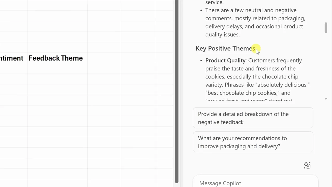
Start by asking Copilot for a high-level summary of your data. In the Copilot prompt box, type a request such as:
Summarize all customer feedback in this worksheet. Include the overall sentiment, top positive themes, top negative themes, and examples of comments that support each theme.
Copilot can return an overall summary, list common positive and negative patterns, and show sample comments that explain what customers like or dislike. This gives you a fast overview before you move into deeper analysis.
Search for specific issues
If you need to address a specific topic, ask Copilot to isolate relevant rows. Type a focused request like:
Show me all feedback related to pricing.
You can also search for delivery problems, product quality complaints, packaging issues, refund requests, or support delays. This saves you from scanning hundreds of rows manually and helps you move straight to the comments that need attention.

Pro Tip: Ask for both the filtered rows and a short explanation. For example, use: “Show me all feedback related to pricing and explain the top three pricing concerns customers mention.”
Generate a word cloud using Python
Visualize recurring words by asking Copilot to create a word cloud. Copilot can write and run Python code and return a downloadable image when Python in Excel is available in your environment.
Larger words usually indicate higher frequency in your feedback dataset. A word cloud is not a full analysis by itself, but it is useful for quickly spotting repeated terms such as “shipping,” “price,” “quality,” “refund,” or “support.”
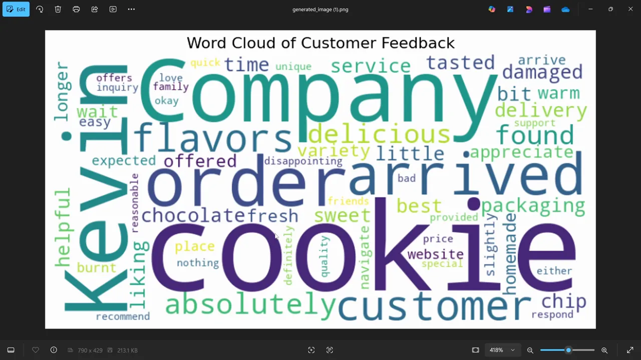
Warning: Do not rely only on a word cloud for business decisions. Common words can be misleading without context. Use it as a visual starting point, then confirm patterns with sentiment labels, theme categories, and sample comments.
Analyze sentiment in cells with the COPILOT function
Move beyond the chat pane by using the Copilot function. Enter a formula directly into a cell to generate results for every row. Use the following syntax:
=COPILOT(“give me the sentiment”, A2:A20)
The first argument defines your prompt and the second defines the range of your feedback. Press Enter to see the sentiment returned in the cell. For clearer results, ask for a limited set of labels such as Positive, Neutral, and Negative.
For example, you can use a more specific prompt like:
=COPILOT(“Classify each comment as Positive, Neutral, or Negative only”, A2:A20)

Customize your outputs
Refine your prompt to change the data format. Replace “give me the sentiment” with a request for specific visual outputs like emoji symbols. For example, use “give me the sentiment as a smiley face, a neutral face, or a mad face” to generate icons instead of text.
This makes scanning results faster, especially when you want a quick visual view of customer mood. You can also ask Copilot to return short tags such as Price Concern, Delivery Issue, Product Quality, or Customer Support.
Filter by sentiment
Once you have a sentiment column, apply Excel filters to isolate issues. Select your column header, navigate to the Data tab, and enable Filter.
Uncheck all options and select only the “mad face” icon or the Negative label to view problem comments. This helps you focus on specific areas for improvement, such as delivery delays, confusing instructions, high prices, damaged packaging, or poor support experiences.

Extract and categorize themes
Knowing the sentiment is helpful, but identifying topics provides more context. Use the Copilot function to generate categories:
=COPILOT(“Give me the feedback theme”, A2:A20)
Copilot can assign comments to categories like product quality, packaging, delivery, pricing, returns, or customer service. It can also return multiple categories for one comment if that comment covers more than one issue.
For cleaner reporting, give Copilot a controlled list of categories. For example:
=COPILOT(“Categorize each comment as Product Quality, Delivery, Packaging, Pricing, Support, Return, or Other”, A2:A20)

Live data updates
Your analysis can remain live as your worksheet changes. When you edit a feedback entry, Copilot-generated sentiment and theme cells associated with that row may update based on the new text and workbook behavior.
This is useful when new survey responses, customer reviews, or support notes are added over time. You can keep the same analysis structure and refresh your summary as the dataset grows.

Summarize counts with PivotTables and charts
Count positive, neutral, and negative comments using a PivotTable. Click your data, go to Insert, and choose PivotTable. Drag your sentiment or theme column into the Rows and Values fields to view occurrence counts.
This turns text analysis into measurable data. Instead of saying “many customers complained about delivery,” you can show how many comments fell into the delivery category and compare that count against pricing, product quality, packaging, or support.

Add a visual layer by inserting a PivotChart. Select the Insert tab, choose PivotChart, and pick a pie or bar chart type to highlight which topics occur most frequently. Bar charts usually work well for comparing theme counts, while pie charts can help show a simple sentiment split.

The real value of Copilot in Excel is not just faster summaries. It is the ability to turn open-ended customer comments into structured data you can filter, count, compare, and act on.
Best practices for prompt engineering
- Keep your workbook in the cloud to ensure Copilot access.
- Use a clean table with one feedback entry per row.
- Write specific, concise prompts to improve output accuracy.
- Tell Copilot the exact labels or categories you want when consistency matters.
- Use the =COPILOT() function for cell-based results that allow filtering and sorting.
- Review a sample of Copilot’s outputs before using the results in reports or decisions.
- Combine text analysis with visual tools like word clouds, PivotTables, and charts for a complete overview.
Useful Copilot prompts for customer feedback
Use these prompt examples as starting points when analyzing comments in Excel:
- Summarize the main themes in this feedback table.
- Classify each comment as Positive, Neutral, or Negative.
- Identify the top five customer complaints and include example comments.
- Show me all rows related to delivery issues.
- Create a short executive summary of the feedback trends.
- Group each comment into one of these themes: Pricing, Delivery, Quality, Support, Packaging, Returns, or Other.
- Suggest three actions our team should take based on the negative feedback.
Common mistakes to avoid
One common mistake is asking broad questions without giving Copilot enough direction. A prompt like “analyze this” may return a general answer, but it may not give you the labels, counts, or themes you need.
Another mistake is using messy data. Blank rows, mixed columns, inconsistent labels, and merged cells can make the analysis harder to trust. Clean your dataset first, then ask for a small test output before applying the same prompt to a larger range.
You should also avoid treating Copilot’s results as final without review. For important business decisions, check sample rows manually and confirm that sentiment labels and themes match the original comments.
Frequently asked questions
What do I need to run sentiment analysis with Copilot in Excel?
You need a Microsoft 365 subscription with Copilot enabled. You should also save your workbook to the cloud so Copilot can access and analyze your worksheet data.
How do I use the Copilot function inside a cell?
Type =COPILOT into a cell, followed by your prompt in quotes and the range of your data. For example: =COPILOT(“Give me the sentiment”, A2:A10).
Can I customize the output format?
Yes. You can request specific formats such as text labels, structured tags, short summaries, categories, or emojis within your prompt.
Can Copilot handle multiple themes per comment?
Yes. Copilot can identify and return multiple categories if a single comment addresses more than one topic, such as pricing and delivery in the same response.
How do I get counts and visual summaries?
Use PivotTables to aggregate your sentiment or theme columns, then insert PivotCharts to visualize the counts of specific sentiments, topics, or issue categories.
Is Copilot sentiment analysis always accurate?
No AI output should be treated as perfect. Copilot can speed up the first pass, but you should review sample rows, especially when feedback is sarcastic, vague, mixed, or business-critical.
Final takeaways
Sentiment analysis in Excel converts raw customer feedback into actionable data. By using the Copilot chat pane and the =COPILOT() function, you can identify patterns that would otherwise stay hidden in long comment lists.
Start with clean data, ask specific prompts, review the output, then use filters, PivotTables, and charts to turn customer comments into practical next steps. This gives you a faster way to understand what customers value, what frustrates them, and where your team should focus next.
Sources
- Microsoft 365 — Microsoft 365 subscription information.
- Microsoft OneDrive — Cloud storage for Microsoft 365 files.
- Microsoft Support: Get started with Copilot in Excel — Copilot in Excel setup and usage guidance.
- Microsoft Support: Copilot function — Guidance for using the COPILOT function in Excel.
- Microsoft Support: PivotTables and PivotCharts — Excel visual summary and aggregation tools.
- IBM: Sentiment Analysis — Background on sentiment analysis concepts.
Last Updated on June 27, 2026 by Logan Carter

