


Building dashboards often feels like a chore. Pivot tables, formulas, chart formatting, and manual layout changes can take hours, especially when your raw data keeps changing.
Agent Mode helps turn that process into a guided AI workflow. You describe the dashboard you want in plain language, and Excel can plan the steps, create formulas, build charts, and add interactive elements such as slicers. The result is a refreshable report that feels much faster than building every piece by hand.
Quick Answer
Agent Mode is an autonomous AI feature within the Excel Labs add-in that builds interactive dashboards from raw data. Instead of manually creating formulas, charts, and report layouts, you describe your goal in natural language, review the agent’s plan, and let it create the workbook elements for you. It requires Microsoft 365 access and an eligible Copilot setup.

Key takeaways
- Availability: Agent Mode is accessed through the Excel Labs add-in and uses the Frontier model experience for eligible Microsoft 365 users.
- Capabilities: It can plan a dashboard, write formulas, create charts, build KPI areas, and add interactivity such as slicers.
- Best setup: It works best when your raw data is formatted as an official Excel Table with clear column headers.
- Review still matters: You should check formulas, totals, chart choices, and any highlighted insights before sharing the report.
At a Glance
| Best For | Sales reports, KPI dashboards, trend summaries, and interactive workbook reports |
| Difficulty | Beginner to intermediate |
| Tools Needed | Excel on the web, Excel Labs add-in, Microsoft 365 access, and eligible Copilot access |
| Best Data Format | An Excel Table with clean headers, consistent values, and no blank header rows |
Why Agent Mode changes your workflow
You need Microsoft 365 access and eligible Copilot licensing to get started. Once it is available in your Excel environment, Agent Mode can help you turn a raw sales sheet into a complete dashboard with charts, KPIs, formulas, and interactive filters.
The main difference is the workflow. Instead of asking for one formula or one chart at a time, you give the agent a broader goal. It then plans the build, creates the needed pieces, and explains what it changed. That makes it useful when you want a full report, not just a quick calculation.
1. Prepare your data by creating a table
Start by converting your raw data into an official Excel table. This step helps Agent Mode read your data structure correctly, including column names, rows, totals, and relationships between fields.
To create a table, highlight your data, select Insert > Table, ensure the header option is checked, and click OK. Tables allow Agent Mode to use structured references, which makes your charts and formulas update automatically whenever you add or edit rows.
Note: Clean headers matter. Rename vague fields like “Column1” or “Data” before using Agent Mode so the agent can understand what each column represents.
Clean your source data first
Before you start the AI workflow, remove obvious problems from the sheet. Check for blank rows, duplicate header rows, merged cells, mixed date formats, and totals placed inside the raw data area. Agent Mode can handle many tasks, but cleaner data usually produces a better dashboard.
- Use one header row only.
- Keep each column focused on one type of value.
- Use real dates instead of text dates when possible.
- Avoid merged cells in the source table.
- Remove manual subtotal rows from the raw dataset.
2. Enable Agent Mode using Excel Labs
Agent Mode is available through the Excel Labs add-in. Install it by going to Home > Add-Ins, searching for Excel Labs, and clicking Add.
Once installed, the Excel Labs icon appears on your ribbon. Open the pane, launch Agent Mode, and select the Frontier model to start building. Type your natural language requests into the prompt box and let the agent handle the execution.
Warning: Do not paste private, regulated, or sensitive business data into any AI workflow unless your organization has approved that use. Follow your company’s data security rules before testing Agent Mode with real files.
3. Write a prompt to start the AI plan
Type a clear, actionable prompt into the Agent Mode box. For example, use this phrasing: “Build a dashboard to help me understand this data. Include total revenue by category, units sold over time, and profit by month. Add relevant charts to tell the story behind these numbers.”
When you submit your request, Agent Mode performs two main actions:
- It plans the steps to build the dashboard instead of guessing.
- It executes the plan by creating the necessary tables, formulas, charts, and layout.
Use a stronger dashboard prompt
A stronger prompt gives the agent your goal, metrics, grouping fields, visual style, and review expectations. You can use this template:
Build an interactive dashboard from this Excel Table. Show total revenue, total profit, units sold, top categories, monthly trends, and any unusual patterns. Use clear KPI cards, charts, and slicers. Explain the formulas you create and verify that the totals match the source data.
This prompt works well because it tells Agent Mode what to build and how to check the output. You can adjust the metrics for your own dataset, such as leads, expenses, inventory, orders, support tickets, or project hours.
Pro Tip: Ask for verification in the prompt. A line such as “show how you checked the totals” helps you review the result faster.
4. Review the dashboard and verification steps
Agent Mode provides a complete dashboard alongside a detailed explanation pane. This section shows you exactly what the agent built and where it placed specific items.
It also lists the formulas it created and the verification steps it took to check the numbers. If the agent notices that one category leads revenue by a large margin, it may highlight this insight for you.
What to check before trusting the report
Always review the finished dashboard before using it for decisions. Look at the totals, chart labels, slicers, formulas, and source ranges. Make sure the dashboard answers the question you asked and does not skip an important segment of your data.
- Totals: Compare dashboard totals against the original table.
- Dates: Confirm that monthly or weekly charts use the correct date column.
- Categories: Check whether blank or misspelled categories were grouped correctly.
- Formulas: Review formulas for structured references and correct ranges.
- Charts: Make sure the visual type matches the message you want to show.
5. Make your dashboard interactive
Since the dashboard uses real Excel components, the charts and KPIs update automatically when you change the source data.

Ask for specific features to add interactivity. For instance, ask: “Add a slicer to filter by category.” The agent will place a slicer on your worksheet that filters all linked KPIs and charts instantly.

Useful interactive features to request
Slicers are only one option. You can also ask Agent Mode to add filters that match the way people will use the report. For a sales dashboard, filters by category, region, salesperson, month, or product line can make the dashboard more useful.
- Category slicer: Filters charts by product or service type.
- Date filter: Helps users review performance by month, quarter, or year.
- Region filter: Makes location-based trends easier to compare.
- KPI cards: Shows top-level numbers such as revenue, profit, and units sold.
- Trend chart: Shows whether performance is rising, falling, or flat over time.
6. Polish and share your report
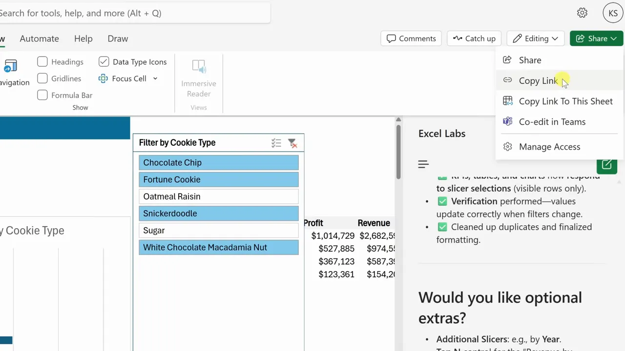
Agent Mode builds the functionality, but you can refine the presentation. Use the View tab to turn off gridlines, headings, and the formula bar for a clean look.
Right-click your raw data sheet to hide it from your viewers. When you finish, click Share in the top right to distribute your report to others who have the appropriate access permissions.

Make the dashboard easier to read
Small design changes can make the report easier to scan. Keep the most important KPIs near the top, use short chart titles, and avoid crowding too many visuals into one screen. If a chart does not support the main point, move it lower or ask Agent Mode to simplify the layout.
- Use clear chart titles that explain the metric.
- Place the most important KPI cards above detailed charts.
- Hide raw data sheets when sharing with viewers.
- Keep slicers near the visuals they control.
- Test the dashboard after changing source data.
Agent Mode versus Copilot
Copilot helps you with single tasks like generating a formula or summarizing a small range. Agent Mode handles complex, multi-step projects by architecting the entire build. Use Copilot for quick fixes and Agent Mode when you need to construct a full report.
Copilot vs Agent Mode
| Copilot | Best for quick tasks such as writing one formula, explaining a range, or summarizing selected data. |
| Agent Mode | Best for larger workflows such as planning, building, checking, and refining a complete dashboard. |
Quick checklist to build your first dashboard
- Convert your raw dataset into an Excel table.
- Clean column headers, dates, blanks, and obvious formatting issues.
- Install the Excel Labs add-in and open Agent Mode in the Frontier model.
- Write a clear prompt describing your target visuals and metrics.
- Ask Agent Mode to explain its plan and verify the totals.
- Review the generated plan and verification steps.
- Test your data refresh and add interactivity with slicers.
- Polish the view and hide raw data before sharing.
Troubleshooting common Agent Mode issues
If Agent Mode does not produce the dashboard you expected, the issue is often related to the source data, prompt clarity, or workbook setup. Start by checking the basics before rewriting the entire report.
Agent Mode cannot understand the data
Make sure your data is formatted as an Excel Table and has clear column names. Avoid blank header cells, merged cells, and unrelated notes inside the data range.
The dashboard uses the wrong metric
Rewrite your prompt with the exact metric names from your table. For example, say “use the Revenue column for sales totals” instead of “show sales performance.”
The chart looks cluttered
Ask Agent Mode to simplify the visual. You can request fewer charts, shorter labels, a monthly trend instead of daily detail, or a top-five category view.
The numbers do not match the source table
Check filters, blank rows, hidden rows, and formulas. Then ask Agent Mode to explain how each KPI was calculated and which source columns were used.
Frequently asked questions
What do I need to use Agent Mode in Excel?
You need Microsoft 365 access and eligible Copilot licensing. You can use it in Excel on the web through the Excel Labs add-in when the feature is available for your account.
Can Agent Mode work with my existing tables?
Yes, it works directly with standard Excel tables. For the best result, make sure the table has clear headers, consistent formatting, and no blank header cells.
How do I install Excel Labs and Agent Mode?
Navigate to Home > Add-Ins, search for Excel Labs, and click Add. Once open, select Agent Mode within the Frontier model experience.
Can I refine the dashboard after creation?
Yes, you can request changes to charts, formulas, filters, layout, and KPI cards using natural language prompts at any time.
How is Agent Mode different from standard Copilot?
Copilot is better for simple, single-step tasks. Agent Mode is designed for multi-step workflows where the AI plans, builds, verifies, and explains a larger report.
Should I still check the dashboard manually?
Yes. Always review formulas, totals, filters, and chart labels before sharing the dashboard or using it for decisions.
Final thoughts
Agent Mode removes much of the intimidation from dashboard building. You provide the intent, and the AI handles the assembly of formulas, visuals, filters, and layout. That makes it a useful option when you need a working report quickly but do not want to build every chart and formula from scratch.
Start with a simple dataset, format it as an Excel Table, and write a clear prompt that names the exact metrics you want. Then review the agent’s work carefully. When you combine clean data with a specific prompt and a final human check, Agent Mode can help you turn raw numbers into a dashboard that is easier to understand, share, and update.
Last Updated on June 27, 2026 by Logan Carter

